Quantum Leap (week two)
Shrine (week three)
Love Your Body - Poster Design (week four)
Branding Logo Design Project
In this project I was required to design and create a logo for a company, organisation or event.
For the very first session, we had to research and later write at least four hundred words on what a logo is and its purpose within the idea of this unit: Words and Images. I also had to identify the specific five criteria that a logo would have to meet in order for it to be considered a good logo; these five criteria were: Describability (or simplicity), Memorable (or original), Effective without colour, Scalable (still effective when enlarged or shrunk) and relevant to the industry it is promoting. Here is what I actually wrote:
What Makes A Good Logo?
Many logos have been created over the years,
and although various specialist soft wares have been introduced, specifically
dedicated to aiding designers to produce, perhaps more professional looking
logos and other such documents, the criteria that, in a way distinguishes a good
logo from a poor one has barely changed. There are four things that are
necessary to consider when you wish to determine if a logo is “good” or not
(this must be considered carefully because a company’s logo is the first, and
consequently the most influential thing a possible client will see):
1)
Are you able to
describe the logo? In other words, is the logo simple enough or too complex for
you to absorb when seeing it for a short period of time every day?
2)
Would the logo
still be effective if enlarged, shrunk or printed in black and white?
3)
Is the image
featured relevant to the object(s) or company it is trying to promote (which
can sometimes be difficult to determine for sure)?
4)
Is the logo
memorable to a passer-by?
Also in the first session we had to find a minimum of five logos already in existence and consider whether they fit these five criteria, and if so, why? (This analysis could also be included in the four hundred worded piece.) I chose to analyse the logos for: Red Bull, WWF, McDonald's, Apple and Walt Disney. I chose these in particular because they are all promoting different industries but they are all well known and common place within modern society. Furthermore, I wanted to consider what other factors made them so successful in their own rights. This analysis was very beneficial when coming up with ideas for my own logo and developping them because it helped me to make them more professional looking when I incorporated some of these factors, like the lack of lots of colour and simplicity. Here is what I said about each logo:
Red
Bull Logo
The
Red Bull logo uses only two colours therefore it is aesthetically
pleasing to the eye; nevertheless, it is still effective when printed
in black and white as the layout is clear and the logo is set on a
white background. Due to the simplicity of the layout, as well as the
choice to use an easily legible font, it can also be blown up or
shrunk, yet still be effective and recognisable as the same logo.
Furthermore, the graphics used within the logo, although clearly relevant to the name of the brand therefore immediately recognizable; with regards to the fact that it is, in essence promoting an energy drink, it seemingly holds no relevance to this. With this in mind, if the words “energy drink” weren’t incorporated into the logo design when it was first produced, an onlooker probably wouldn’t associate this use of graphics with the object it was meant to be promoting.
Walt Disney Logo
There
are many variations that have been produced over the decades to
promote the company “Walt Disney” from when it was initially
established till now; nevertheless, the same text, the same graphic
of the Disney Castle (located both in Florida and Paris’ Walt
Disney World) and the same colours remain consistent in all these
logo deigns as they are memorable to the public and recognizable as
Walt Disney (the only thing that changes appears to be the layout).
Again,
similarly to that for red bull, only two colours are used here, and
although the design isn’t as simple as those alongside it that
promote other famous film companies, it’s still effective when:
blown up, shrunk or printed in black and white because the logo is so
common place and recognised for what it promotes.
WWF Logo
The logo is memorable because the image is iconic, yet relevant to the industry it hopes to promote (an animal protection organisation). Furthermore, due to the fact that only two contrasting colours are used and the logo is simple because the graphic doesn't have a lot of detail therefore it is easily describable, effective without colour because only balck and white is initially used here; and finally, due to its simplicity, its scalable.
McDonald's Logo
Arguably, this logo could be considered as relevant to the industry in question, in this case: fast food. The graphic of the "M" appears to be constructed out of a chip(s) which is served at the fast food chain it promotes. Similarly as to those used in the WWF logo as well as many others, only two contrasting, yet identifiable colours to the industry, and a simple layout are used. These facts also enable the logo to fit the purpose in relation to the four / five criteria for a good logo design.
Apple Logo
Although identifiable as the logo for the technological industry in question, perhaps because it is included in the design of all products and this factor, in turn suggests its describable, memorable and always effective when re-scaled to various different sizes (ranging from very big, like when the company is advertised on bill boards, to very small, like on the back of an IPod) or printed without colour (which it usually is, considering the original design is in black, white and different shades of grey). On the other hand, the chosen graphic of the silhouette of an apple (with the addition of a drop shadow), although the colour is relevant to the colour of the metal material that most of their produce are made from, the design itself is in no way relevant to the technological industry. It is only relevant to the name of the brand.
In the second session, we were split into small groups of four or five to research and produce five pages of initial ideas each. These initial ideas had to be based upon two different industries that we, as a group, chose to work from as a basis. My group chose Catering and Sport because we all have different interests and these two categories are too, very different so it gave everyone a chance to take an interest in one or the other or both. Here are those five pages I produced at home between sessions two and three:


Personally, I liked this oppotunity we had to work in groups of people we wouldn't usually interact with (which included two girls, including myself and a friend, as well as three boys, two of which I had never spoken to up till then). I liked it because not only did it give us a taste of what it will be like if we decided to work in a graphic design company in the future with a team around us; but also, after we had completed those first five pages of initial designs, we came together again, and with their help and conficlting opinions I was able to choose which two logos to develop.
To be honest, I liked the majority of these initial designs but some, I now realize are too complex as opposed to those i had already analysed in the project. Such ideas include: the fast food logo in the bottom right corner of the fourth page because there are two many graphics, as well as too many colours used. The sport logo in the bottom right corner of the second page has the same problems:


In the end, I chose the "Eagles" sport logo for a sport team on the third page, as well as the knife and fork logo for a restaurant on the fourth page. I decided upon these two, firstly because most of my peers, including my teacher liked them, and second, because they are both simple and lacking colour at this stage, therefore I can easily develop them a lot throughout the rest of my project:


After having chose these two, for the next session, I had to use the computer to produce a further five A4 pages of developments from them, but only in balck and white at this stage. The first thing I did was look on the internet, and by using search engines including: Google and Bing, found an assortment of similar graphics to those I used in my original design.
Firstly, with regards to the logo featuring the eagle I found some of silhouettes of them flying, along with others of eagles heads and faces, all in balck and white. On the first of the two pages I produced by developping this logo, I used my favourite silhouette which seems to be that of an eagle swooping down to catch its prey and rubbed out the additional images surrounding it. I then placed the image into Abode Illustrator CS6 from Photoshop, which I used to rub out areas of the photo, and added a sketch effect to this edited image to make the outlines of the image a little less straight and clean. Finally, after browsing www.dafont.com, by typing in the "eagle" into the search bar, I found a font called "EagleClaw" that I downloaded before resizing and arranging it around the graphic of the silhouette to see which layout seemingly worked and looked the most aesthetiaclly pleasing, according to myself, as well as my three best friends in the group that I ask for opinions from.
For the second page of "Eagles" development, I took a my favourite graphic of an eagles head and placed it into "Photoshop Elements 9". From there, I experimented with every single effect I could add, and saw what they looked like before choosing nine to display. From this piece of development I hoped to remember what they looked like; as this specific piece of software didn't have as much features to offer as opposed to that I had available to me at college, I still wanted to try and take advantage of what I could produce with these effects later in the project but at home instead.
As for the knife and fork logo, I also found an assortement of images similar to that I had drawn in my initial design from the internet. On the other hand, as opposed to taking an image directly from this selection, I drew a copy of one I found and that I liked, only by hand in Abode Photoshop Elements to exercise my drawing skills on the computer.
In order to develop this I first experimented with the layout of the plate, knife and fork; as well as the arrangement of what would be in front and behind. In the end, I specifically liked the traditional layout of both the knife and fork placed together vertically in the centre of the plate, but I preferred to layer the knife and fork on top becuase, if not, the lines overlapping make the overall graphic less clear:

For the second stage of development I took this layout and experimented further by dragging the utensils apart slightly each time, while, respectively making them wider. From doing this I noticed that the outlines thickened at the same time and your eyes are automatically drawn to those areas (mine were anyway):


 Consequentially for the fourth step of my development I used a new version of the original graphic (only this one with the knife and fork laying slightly to each side of the plate) that I felt was simpler; and further experimented with the various black highlights I could add to it, in order to make different areas stand out. Then, for the second time, I asked my peers to pick their favourites out of the four that I had come up with, and the majority chose the top left and the bottom right composition: They thought that the top left was strong yet simple, and the bottom right demonstrated my ability to draw. My teacher also thought that it would be beneficial to use one that I had drawn on my own because it would demonstrate my skills.
The next page in my project was simply finding a font that I felt was appropriate to place alongside this particular graphic, in order to promote the restaurant industry. The font is another I found from "www.dafont.com" and it is called "Cafe Lounge19". The only problem with this font was, due to the extent that the letters are dragged in each direction, I wasn't able to position the text in a curve that followed the outline of the plate like I'd wanted to because it was too big and the size of the plate? It was too small as well. Henceforth, for the next stage of my development I enlarged the plate so the knife and fork graphics were now positioned inside the plate and tried again to arrange the text, only this time with a more legible font until I had three pages (consisting of twelve) of different designs I created around this idea:


 After having discussed with others around me which one they peferred of these designs and why including: my teachers, each member of my group (of which there are nineteen), my parents, siblings and even a member of the public (as a part my market research); a received much advice, and decided upon these two as they were suggested most and they are also my favourites:
To determine which of the two I would decide to the final stages of branding I experimented with: colour and fonts, as well as the size of these fonts to minimise the negative space as much that I could without jeopardising the logo's clarity and effectiveness. Whether the logo were, printed in black and white (which I hoped to increase by the like of use of lots of colours) or shrunk and enlarged. After I had experimented with all these factors, I finally managed to produce a design that I feel maintains all these factors, as well as being memorable, describable and relevant to the industry in question:

Evaluation
As the project came to an end, I placed and branded my logo on stationary materials and a sweatshirt (referred to in the brief as "company materials"). Another thing I particularly like about my final logo design is that it was initially designed to be on a white background. This: not only aids the logo's continuous effectiveness and simplicity no matter how it is printed, but when I placed the logo onto items it seems to blend more. Personally, I don't like designs such as those on t-shirts when the background as a completely contrasting colour to white because I think is looks unprofessional and tacky!


I was meant to complete the previous logo design project with Zoe, however, she had to leave before we began our Consolidation Project because she went on maternity leave.
Lo - Fi Zine (pagelayout) Project
In this project I was required to design and produce four pages of a magazine focusing upon a topic of my choice. These four pages had to include a front cover, evidently, a spread and a single page. While I had to consider typography, page layout and the images I would use; a major part of the project had to be considering the materials, techniques and processes that would be involved in producing such a magazine. The answer should vary depending on the topic of the magazine, whether that be: design, sport, gaming or, in this case, music. To begin, I wrote a proposal consisting of at least four hundred words on the type of publication I intended to produce, or in other words what it would be about and how it would look... This is what I actually wrote:
During my first four week induction, my favoruite project was the shirne we did with Julie, consequentially, as I had focused upon one of my favourite artists, in this case: Michael Jackson. In turn, I have decided I will base this magazine project around another of my equally favoured and respected artists, but this tim: Eminem. He is a considerably different individual to Michael in every walk of life, therefore the use of Eminem as my latest focal point adds a slight diversity t graphic design projects, and yet, they are similar, at the same time.
I will begin the project by first: browsing on search engines, such as: www.bing.com as well as "www.google.co.uk" in order to find two articles. One will hopefully focus upon an individuals point of view, with regards to the statement of whether "Music Can Change the Way the We Think and Act". I also want to find, ideally, a pre-recorded and / or pre-written article, which is, in some way relevant to the significant influence that music can have on a person's life, particlarly in Emniem's. If I can't find this however, I wouldn't mind having to edit or even write a made up interview after watching some of his interviews on www.youtube.com. I think that any kind of editing of original sources on the Internet could put me in stead for gaining extra credit; this of which I read in the criteria for the Lo-Fi Zine (pagelayout) Project, under task three.
Secondly, I will take a similar approach when looking for an assortment of images I could use on the magazine's front cover, as well as alongside the articles. Although, I would like to take my own pictures myself, that would probably require me to been in the front row at an Eminem concert and that is near to impossible. Consequentially, I will definetly edit at least the size and the brightness / contrast / hue / stauration of the image using either Abode Photoshop CS6 or Abode Photoshop CS5 instead. By doing so, I hope to gain more credit, additionally to that I hope to, referring to the editing I will do on the articles, as to ensure there are no plagerism issuses.
Thirdly, I will then come up with a name for my magazine, perhaps something relating to the concept of change or influence; before experimenting with fonts and typography by arranging them alongside the graphics, roughly as to how they would be displayed in the final design.
After I have made a decision as to what I wish to include in my magazine design, its just a case of designing layouts, in the format of sketches and making the final project in Abode InDesign, with the help of Photoshop and perhaps even Illustrator as well which are all available to us at college.
As this is a music magazine and from market research which consisted of first researching different types of paper commonly used nowadays to print professional magazines on, as well as buying a selection of different magazines (which will also influence my layout designs); I will probably use Coated Paper or something similar if I get round to printing it professionally at the very end, but this isn't a necessity I don't think.
Next, in order to demonstrate that I was able to explore a variety of materials, including: paper types and imposition, techniques and processes safely, I started by finding different paper types commonly used to print magazines that have later been published professionally. Those I found were respectively: Coated Paper, Uncoated Paper, Recycled Paper, Silk Paper and Matt Paper. Along with this, I did further research on each, examples of magazines that had been printed on them, features they provided through their structure:
Is the ink absorbed fully (making the image duller) or does it simply lie on the surface of the paper (ensuring that the graphics included within the design are sharper and brighter)?
The environmental impact of using each paper to manufacture the magazines on a mass scale?
The expense when producing them on a mass scale?
Are any of them similar or different with regards to these features listed?
What Iactually wrote following this research, as well as a small selection of magazines I used to help me identify these features are displayed in my practical work I handed into our tutor to mark for next week.
The next two stages of my project, first involved creating an assortment of images which I would later select from further. These images could I either be gained by taking them myself or gathering them from the internet, although I had to clearly identify this within my project in order to avoid copyright. Although I would have loved to take the pictures that would be a significant part of my publication myself; alongside the kind of articles I wanted to include in the magazine, this would have been almost impossible to achieve, particularly, due to the fact that my main article that would feature on the spread was an interview of Eminem and I needed a selection of a large close ups. In this case, which would have been the same but perhaps less so if I had taken the images myself, I had to display some kind of significant image editing and manipulation with the images I was going to use in the final magazine design. In order to demonstrate this I used a combination of Abode Photoshop CS6, Abode Photoshop CS5 and Abode Illustrator to: crop, adjust the hue, saturation, brightness, opacity and contrast of most images, particularly, including that on the front cover which I added additional random effects to in order to make the whole image darker. This use of effects, I hoped would add a sort of ominous and mysterious feel to the final design when I incorporated them. These are the few edited images that I decided to use in my magazine and where they have been used:


Secondly, I had to research and produce a copy of articles to be used in the publication. This was achieved in a similar way to that I collected images I would use. I too found the basis for these articles on the Internet, and again, within my project I had to reference to these sites that I found them on appropriately in order to avoid plagiarism issues. Nevertheless, in order to, hopefully increase the credit I wished to be awarded for the sources I used, as I had with the images, in relation to the grading criteria I also edited the articles. For the article entitled: "Can Music Change the Way We Think and Act?" I felt that the way it was written was very personal because he (the original author of the article) kept explaining what he, personally thought with relation to what it was saying. It isn't because I don't agree, but it isn't my words so it didn't feel right, so consequentially I edited these areas so it appeared more of a group agreement as opposed to that of an individual. Furthermore, for the Eminem interview that I found there was I different incipience; it was mostly relevant to the article regarding the influence of music, I wanted to place alongside it, however, it was way too long so I decided to read the whole article before combining the questions already asked in the interview, re-wrote them in a way that I hoped would still sound like him. In the process, I also wanted to make it a lot shorter. These are the two edited articles that I decided to use and where:


For the third stage of my development, again I visited www.dafont.com to find a selection of approapriate fonts that I could use for the title on the front cover. In order to find these fonts I typed such words as "graffiti" and "distorted" into the search bar. I had to consider this decision very carefully as with: the choice of fonts, the images, the colours, the layout and the articles; I wanted to create an urban, youthful feeling that is common within most music magazines, as I nhad observed. At the end of the day, I liked the top design on the first page and the bottom design on the second page. I think that they both suite the topic of music.
After I had produced the front cover image, I placed both fonts alongside it to see which was clearer while situated rouglhy where it would be in the final design. This way I was able to choose one with the knowledge of how it would look, which I liked:

Obviously, at this stage I had to find a name for the magazine. Following some market research as well as from my own knowledge, I knew that most music magazine titles don't relate to the topic of music in the slightest. I didn't want to take the first word that popped into my head so, with the magazine focusing on the influence that music can have, I picked "Revolution" because it relates to the concept.
I would have used the same type phase for everything, but if had, I don't think that the title wouldbe as much of a feature. Due to the same research I carried out when configuring an approapriate font for the title, I concluded that I would use a more legible font the remaining text in the magazine to add a sense of continuity. When I had produced variations of layouts for the titles on the front cover; for the fourth and final time within this project I asked my peers for their opinions before finalizing my own:

I chose the third design from the top on this page because I like the way the text gets bigger with each line. As the text is bigger on the bottom line, most emphasis is placed on it. I also like the effect created by adding a drop shadow to the text because when incorporated into the design at the end, it will give it a more three dimensional feel. On the other hand, with the background image having a black background behind the text, i could increase the opacity of the shadow to make this effect more prominent. Too, in order to enhance the effect as the clarity of the text, I probably could change the text to white as opposed to black:

Before developing and producing the artwork for muy final magazine in Abode InDesign; as specified in the brief, I was required to produce some designs for layouts in the format of rough sketches. While sketching them I particularly had to focus upon the placement / arrangement of typography and images, juxtaposed together. In this case, I produced three sketches and the third of which I chose to use for my actual magazine design. These are to first two designs I produced that I liked also but not as much:


This is the third design that I had decided to base my final magazine around:

In this design there are four columns, seperated by three gutters and bleeds of the same diameter all the way around. I decided to include bleeds to ensure that if it were printed professionally, there would be no risk of a white border. i felt this was a precaution worth taking because I didn't think that a white border would be approapriate to have on a music magazine's front cover (perhaps a white border would be more approapriate on a magazine that was more expensive and focused on the arts for example) because the black background of the image would clash too much and it wouldn't look very professional. Also, the design itself is loosely based around the layout that Kerrang used to use. I liked the fact that within that design, although the text is arranged strictly into the columns underneath, the images are not. I believe that not only does this give the magazine a more youthful feel to it as a I had initially hoped to create, but its also very powerful and eyecatching I think.
I think that first, by previewing what the typography would look like, in relation to being layered on the of the images, as it would be in the final design; as well as also looking at different layouts were beneficial steps to take because I was more confident when beginning to create the final thing that it wouldn't take me long and I would, undoubtedly nbe pleased with the final result. This is the final magazine that I created. This is the front cover:

This is the spread that features the re-written interview with Eminem:


Finally, this is the single page that features the edited articel, entitled "Can Music Change the Way that We Think and Act?":

Evaluation
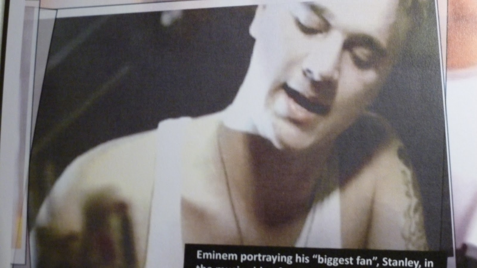
In short, I am considerably happy with the way that the magazine came out. I that was able to include all sources and created the youthful, urban and powerful look the initially wanted to provoke through the magazine. I treid to use a dark colour scheme throughout as well as the same two fonts throughout to create as sense of continuity and that this is all the same magazine. In the end, I didn't include page numbers because I didn't feel they were necesaary a as the magazine only had four pages in all. Ideally I would have hoped to produce more pages, perhaps a Contents page or another single page. Also, within the spread, I struggled to find approapriate pictures so I had to resort to looking back at other music magazine spreads featuring musician / artist interviews for inspiration. In the end i chose three: a posed image, a snapshot of his perfomance following him winning a grammy award and a frame taken from a music video. That taken from the music video as well as that of Will.I.Am are a little pixelated because the images, which I found on the Internet were small orginally. Apart from these minor disappointments and struggles however, I am very proud with my final product.


No comments:
Post a Comment