Stationary Project
After having been introduced to Abode Illustrator CS6 over the last couple of months, the primary objective that we had achieve within this project, was first, to produce a logo for a company, event or organisation, in a field of our choice; in fact, the place could be real or made up, whatever. I decided that I would produce a logo for a fast food restaurant entitled “Danny's Diner”. After having decided, I had to complete an Assessment Log, from a template we were provided with which included: the name of the company, the target audience of which the logo will have to appeal to, or in other words, who is going to use the restaurant (sex and ages), what the logo should say about the company which should match a potential customer's expectations (in this case: quality food, efficient and accommodating). Within the Log, we also had to include three other examples of logos (I chose the McDonalds Logo, as I had as an example in Julie's project as well, the logo for Domino's and the final one for a chain, larger in America I think, which is called simply “Fast Food”) promoting company's in that area we chose along with a short evaluation of each. In my case, I chose catering. I chose to work within the field of catering because: firstly I was when it came to designing a logo in Julie's project as well, and secondly, due to the fact that at this point, I had already completed two A4 sheets of initial ideas for catering, some of which were specifically designed for fast food restaurants in fact. As I had already created a basis for a fast food restaurant logo, I wouldn't have to create an entirely new one, therefore it was less time consuming.
With a number of initial ideas drawn out in front of me, I then began some market research on the Internet. I did so by first, typing in “Diner Logos” into Google; and then from these that already existed I drew a quick spider diagram of features most of their designs had in common. These features included: small pallet of colours used, legible typography, geometric shapes, graphics associated with movement and speed (arrows, vehicles etc.) and relevant objects (a waitress, food, beverages etc.).
Finally, with the initial idea that I had chosen, I began developing it by incorporating: an arrow, geometric shapes, a picture of a milkshake that was, in essence the initial idea, a legible font and finally two different contrasting colours. After I had designed a logo that I was happy with, I decided to experiment further still by changing the colours, including those used initially by McDonalds. I thought this was appropriate at this stage because a thought occurred to. The colours I use within the design have to balance each other out and pleasing everyone. Consequentially, before applying them to a business card and letterhead, I wanted to decide on the use of two colours, roughly. I wanted one to be a colour associated with girls and the other commonly associated with boys, so in the end, I chose purple and blue.
Junk Boys
As an additional step to inspire us and help us to design our Business Card and Letterhead, but also to put into play the skills we have learnt in Abode Illustrator CS6, we were given the "Junk Boys" examples and had to try and recreate them.
 |
| Junk Boys Logo (the original / my version produced on Abode Illustrator CS6) |
 |
|
Junk Boys Business Card (the original with the graphic / my version without the graphic produced on Abode Illustrator CS6) |
1) Is it Fun / Friendly? Fun.
2) Is it Retro or Stylised? Retro.
3) Is the graphic(s) used relevant to the company it is promoting? Yes.
4) Does it portray the characteristics you would want such a company to provide: Efficient, Quality Food and Accomodating? Firstly, the large arrow incorporated into the design could, as far as I'm concerned could suggest direction and speed but apart from that loosely. Alhtough a food graphic isn't incorporated into the design, a beverage is, and from personally carried out market research, a reference to the actual food or drink it serves wouldn't be included within the design if it wasn't quality. I don't think companies woud risk mass public disatisfaction with there produce if it was advertised so publically. Finally, I purposefully used both purple and blue together, not only to enusre that the logo is eye cathcing as well as aesthetically pleasing, but also blue is commonly associated to be a masculine while the purple, a feminine colour. this would suggest to me that if I was seeing it for the first time, I'd know both sexs were welcome. I think the choice of this fun typography, also helps to spread the message that young people are equally acommodated for. Unfortunately, with the combination of a fun typography with a cartoon graphic, although this might attract older individuals with young families, it might not appeal to young adults and those without families as much because it isn't very sofisticated.
Letterheads and Business Cards
Once I had produced a logo I was proud and I felt fit all the necessary criteria; I then began browsing the internet for existing Letterhead and Business Card designs that I felt were strong before analysing why? Here is what I wrote:
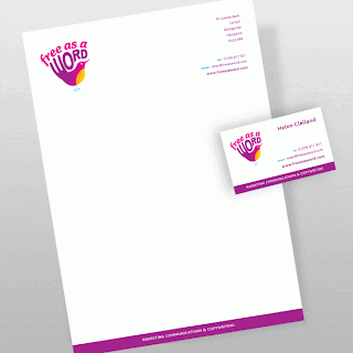
"Free as a Word" Stationary Company (designed by "The Black Cat Creative in Hampshire - http://www.blackcatcreative.co.uk/case-studies/free-as-a-word?backto=37")

I like these particular designs for the letterhead and the business card as they are fairly simple. Only two colours have been used and both designs are recognizable as those for the same company as the layouts are almost identical with the logo in the top left hand corner, the company details in the right and a long line of purple (the same colour as that in the logo) lining the bottom of each. The colours used: pink / purple and yellow work well together and have been especially selected because they both "compliment" each other. With regards to the logo itself, I think that it will have been produced in Illustrator perhaps, as most are. In short, although I love that the design is simple but still strong, I can't help feeling that maybe there is too much negative space in the letterhead design. I can understand that the individuals who designed it initially didn't want to jeoparidise the clarity of the text that will inevitably be placed here; nevertheless, it just looks a little bare. Finally, no texture has been incorporated into this design.
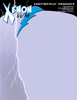
"Xenon Gum" (designed by fellow blogger "Drew's Graphics 2010" - http://drewsgraphics2010.blogspot.co.uk/2010_05_01_archive.html)
 Though this design is obviously very different to that for a stationary company, it appeals to me just as much. In fact, i feel it may be more aesthetically pleasing to me, though I think thats only to be expected. With the use of colours, graphics and fonts it seems to be targetting a more teenage audience. The layouts are arguablly a little similar though the over use of negative space which I didn't like in "Free as a Word"'s letterhead design is eliminated with the lightning graphic which travels from the very top of the page, behind the logo and down to the bottom. Furthermore, I think that the logo has been produced in Photoshop as opposed to Illustrator that is most commonly used to design logos, though the layout and simplier graphics (like the black at the top) are. Finally, though I do like the design I think there are too many fonts used; at the end of the day I think that the use of two are fine but anymore, I would argue, is an over kill! Gradient has been incorporated into this design giving it texture. With the research I've carried out, this seems uncommon in most letterhead designs.
After having analysed over people's work by considering how they have used fonts with regards to: style, size, colour, layout, composition and juxtaposition of text and image, how graphics are probably created and textures applied etc.; I attempted to design my own:
Possible Improvements suggested by Andy Hackett
Every pupil in my Graphic Design group were scheduelled a ten to fifthteen minute review before Christmas 2012. In this review I was told what I had completed and what I had not completed after he had looked over the brief I was given at the beginning of the project. I was informed that I had completed everything and they loved my business card design, nevertheless, there were a few changes that I could make to my final letterhead design. I was told to:
1) Decrease the size of "Danny's Diner"'s logo in the top right hand corner.
2) Similarly, decrease the size of all text (this includes the address at the top, as well as the email and web address at the bottom).
3) Finally, lessen the transparency of the larger logo in the centre of the design to about 10%. I was asked to do this because if text were written over it, it would become confusing and eligible.
Here is what the letterhead looks like with these additional improvements. I think it looks a lot better, and I now understand why my teacher suggested them:
Also, when making changes to the design, I felt that the faint logo in the centre of the design was a little over whelming so I experimented with the positioning by moving it right slightly so its overlaying the edge of the page. Personally I like this layout better than the one above, what do you think?


No comments:
Post a Comment