Photograms (week one)
Some of my Photots taken in the Camera Obscura session (week two)
Pin Hole
5 X 4 (week three)
Camera Obscura (week two)
Moden World Project
Within society there are numerous ways visual imagery are recorded, for example: advertising, film, photography, graphic design, viddeo and the Internet and they very influential. The quality and the extent to which these are influential however depends on the artist or photographer themselves who produced them.
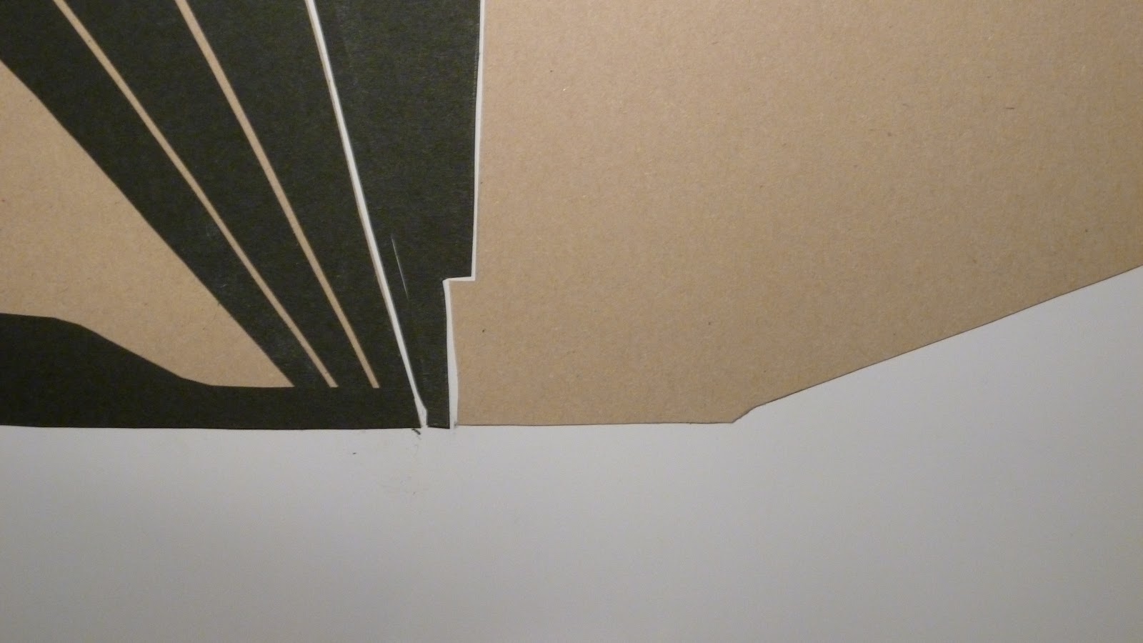
The goal of this assignment was to communicate the ideas of modern world through visual recording techniques, particularly by photography of primary sources like buildings and the environment; as well as graphic design. I built and inspired my visual language skills and understanding by, first recording visually, ten trial images of the modern world in Leeds and the surrounding areas. Then, by using these trial mages, I picked one to use as a basis and cut out pieces of coloured cardboard in these shapes before arranging them in the same way as that in the original photograph I took. I started my first attempt in my second session at college but I only had two hours and it wasn't very accurate. Consequentially, I completed another one at home in the same way of the same photograph, by using black card layered on white paper and cuttings of the photgraph to create this abstract image. This piece of artwork was helpful because it inspired me to try to take some more images of buildings, only at different angles because I simply thought it was aesthetically pleasing with lots of lines at different angles clashing and juxtaposed together.
These are the ten trial images I took, some at the same angle in close proximity to the college, some I simply took in my own local area which is in the suburbs of Leeds and some at night in the centre of Leeds. These included those of the hospital as well as most on the Headrow:
The Headrow


Suburbs of Leeds
On the hard copy that I gave to my tutor to mar for next week.
Hospital

Park Lane Campus
On the hard copy that I gave to my tutor to mark for next week.
Hanover Way
On the hard copy that I gave to my tutor to mark for next week.
Woodhouse Square
This is the original photograph I decided to use as a basis for the abstract image, as well as my first and second attempts of this image:


The second way that I built and inspired my visual language skills was by looking at and exploring the work of different artists, designers and photographers. Personally, I looked at Salvador Dali, Georgia O Keefe and Bill Brandt. In order to do this I used the Internet, predominantly as a secondary resource. I also, specifically, wrote small statements about how the formal elements of their pieces make them powerful and dynamic in there own ways. I also looked at some of the compositional techniques that they all used, their styles, approaches, materials and techniques.
Here is what I wrote about Salvador Dali and an example of his work:
"Surrealism is said to be the symbolic language of the subconscious; truly a universal language. It doesn't depend on education, culture or intelligence." (Salvador Dali)
Salvador Dali solely wanted to challenge an individual to rethink balance and design elements within artworks, or in other words interfere with the common notion of using traditional composition techniques like the Rule of Thirds, Rule of Odds or Rule of Space which are said to make a piece of artwork more aesthetically pleasing to the eye. In order to ineterfere with this particular, it seems to me that he very rarely sticks to the rules of them, if not at all.

My favorite painting by Salvador Dali is entitled "The Persistence of Memory" and it was painted in 1931. I feel that its very interesting and captivating although no especially bright colours are used and some of the objects in the painting aren't particularly pleasant to look at, like the dead horse in the foreground. Each object in the paining doesn't seem to belong, as does those in a dream wouldn't either. None interact, touch each other at all or are displayed in any sort of arrangement in the painting, thereopfre this is a perfect example of his intention to swerve away from using composition techniques. Nevertheless, particularly with the inclusion of melting clocks the painting leaves you wondering what it could actually mean.
Due to the quirkiness of the painting, the nature of the objects within the painting and finally the colours used, I think an older audience would probably appreciate the piece more. Although, many individuals of my own age, if they weren't interested in art, would kind of consider it weird, as well as I little grotesque and pointless, I too appreciate it becuase it is interesting and unique. I think many in my group at college would probably agree with me.
Here is what I wrote about Georgia O Keefe, specifically here painting "New York with Moon":
Through this painting, Georgia O'Keeffe hoped to communicate her passion for New York City. Furthermore, she also hoped to express her emotions as well as her vision of the world through her eyes.

The simple forms and low-angled composition in this painting bring to mind the movement of Precisionism. Precisionism is when an object is painted realistically but with extra emphasis on its "precise and sharply defined" geometrical form. The style itself was and still is strongly influenced by Cubism and Futurism which emerged in the United States of America shortly following the end of World War One (the inter war period). Yet the title was placed alongside in the early / mid twenties. Its main themes were initially the architecture and machinery of the twentieth centure, as well as the industrialization and modernisation of Americas landscape during this critical period in the countries history. As opposed to Salvador Dali, she seems to stick to the notion of using traditional composition techniques considerably closer, particularly the Rule of Thirds and this is demonstrated in her painting "New York with Moon".
At the end of the day, though I'm quite intrigued by this painting and its style, so much so that I would like to take a look at other examples produced in the Inter'war period and primarily influenced by Precisionism. I can't imagine that others my age would feel the same way unfortunately. This is probably because it's seemingly very simple and the colours are very dull and earthy, perhaps "boring", though I disagree! I think older people who were alive when this movement was at its peak would appreciate Georgia's painting: "New York with Moon" more.
Here is what I wrote about Bill Brandt and an example of his work:
Similarly to the work of Geogia O Keefe, photograhers such as Brandt here too exploit the use of: shapes, angles, scales, colours and focuses. He, as an individual uses wide camera lenses to not only to bring forth the viewer's inquisitiveness, but create a sort of surrealistic effect, like Georgia O Keefe and Salvador Dali both did, around the same time; give or take a few decades. A good example of his work which demonstrates what I am referring to is his photograph entitled "London" and taken in 1951. At first glance it is unlcear as to where the photograph was specifically taken, yet if you take the time to focus in on the geometric shapes used within the image it becomes clear where, in which position it was taken, in this case in the girls lap. Furthermore, it also shows us exactly where it was imed at, and in this case, the top left hand corner of the wall, adjacent to that with window.
I explained in sole detail what I also hoped to achieve and this whole process as well as details as to why I would procceed with each step in my "Statement of Intent" which I wrote at the very start of the project:
First of all, during this project, I will use a large variety of primary sources to capture the "Modern World", visually in Leeds. These primary sources will include: Direct Observation of buildings, specifically photographs of Park Lane Campus, as well as those in close proximity to it on Woodhouse Square and Hanover Way. Furthermore, alternative primary sources I will, hopefully, include within the project are: the Natural World (land and sky etc.) but definetly the Constructed World which will include: built environments, urban detail and street furniture. Overall, I hope to take in excess of ten trial photographs, most taken from similar angles, of architecture in the form of brick work. On the other hand, I may take them in other areas and in the dark as well around Leeds, of: fences, benches, lampposts etc. that also visually record the "Modern World". These photographs will hopefully convey some sort of message, idea or feeling. From one of these photographs I will produce an abstract image by cutting out coloured card board in the shapes present on the original photograph and arrange them approapriatly on another piece of blank paper.
Finally, as the project progresses I will continue to use secondary sources for visual recording, particularly the Internet to find artwork and images produced by famous artists and photographs (including Georgia O Keefe, Salvador Dali and Bill Brandt). Combining the research I will do on these artists / photographers, as well as the abstract image(s) I will create in task two, I hope together that they will inspire my photography, not only for the rest of the project, but also in the later future.
Evaluation
After having evaluated most of the ten trial images that I took, I had to choose my favourite four and develop, refine, crop, enlarge, and modify in any way essential before printing them on photographic paper, 8"10:


Photograph of the College Stairs
In this photograph, I like the use of lines here and there that are layered over one another. After having edited this image from that I originally took by increasing the brightness and contrast in Abode Photoshop CS6; it seems to give the print a surreal kind of effect because no where is naturally this bright I don't think.
The only parts that I don't necessarily like about the print are the worn areas of the banister that intrude with the white lines that play a predominant part of the image. Also, as I was in a rush when I took it so when I began cropping the image in Photoshop, it seemed to be taken on a slight angle, therefore it takes away from the professional feel to the image that I originally desired to display.
If I had the oppotunity to take the photgraph again, the only aspects I would possibly change would be the decision to use a tripod as opposed to taking the image free hand as I have quite shaky hands. Also I could try and capture young people walking up the stairs while using their phones for example. This way, I could ensure that more primary sources were visually recorded.
I think this photograph could be used to promote the college. Its seeming perfection, brightness, mass usage of lines at different angles and lack of people gives it surreal, dreamlike effect. It's a building where ambitions are realised and dreams can come true. I think so anyway!
Photograph of the Bicycle in the fore ground and the metal bin behind
In this particular photograph that I took just outside Leeds, I like the iconic contrast created between the ugle, old, disgusting rubbish bin in the background, which is juxtaposed to the beautiful image of the old yet lovely bike as well as the beautiful lilac flowers caressing it in the fore ground. I also like the effect I was able to create when I decided to increase the brightness and saturation of the original photograph. Although it is artificially added, it adds in extra sense of beauty, in contrast to the slightly duller tint I had on the original photograph becuase the weather wasn't very good that day.
Henceforth, if I did have the oppotunity to re-take it I would wait until the weather was fine so I wouldn't have needed to add these addition artificial effects. Unfortunately, I don't think this would have been possible to wait because it wasn't my bike and it probably never be set up this way in the future.
Photograph of the entrance to Park Lane Campus
Similarly to that i took of the College Stairs, I like the geometric shapes produced by the mass of lines within the photograph itself. I also like the sense of perspective within the image, that lead your eyes to the college entrance. Within most of the images I took I tried to inflict this sense, but also incorporate traditional compostion techniques like the rule of thirds at the same time. The idea behind the rule of thirds is to place a partcular focus point in one of the thirds. In this case, it would probably be the furthest left on the middle row.
On the other hand, unfortunately, the colours in the image are very dull. I tried to enhance the brightness of the photograph a little in Abode Photoshop Elements and it helped a little, but its still a bit disappointing as it takes away from the aesthetically pleasing factor I wanted about the image. The colours present on the building however, I have no control over so there is nothing I could do to make it better, even if I wanted to.
This photograph could be used to promote the City of Leeds in a publicity brochure, or similarly to the photograph of the stairwell and most probably, the college itself. Furthermore, it seems to communicate the Modern World theme very well, particularly the impact that the Modern World had on architecture and industrialization.
Photograph of the Red Brick Wall at the junction between Hanover Way and Woodhouse Square
Similarly to that I was able to create i the photograph of the entrance to Park Lane Campus, there is a sense of perspective with a vansihing point in the left side of the photograph. The inclusion of a member of the public almost at the very end of the wall from myself when I took the picture enhances this visual effect also, although this was unintentional which also makes this visual recording of the Modern World better I think. I also, like the contast between to orange of the bricks which is juxtaposed to the dullness of the pavement and the buildings behing the person, so I too enhanced to saturation further to increase this effect.
Truthfully, there is nothing I don't like about this image, and, in turn, nothing I would change, even if I was given the oppotunity.
Photograph of the Bike / Bin and Red / Orangey Brickwork with the person's silhouette in the background
Though I don't imagine either could be approapriatly in many different contexts, for example: in a publicity brochure with graphics promoting the City of Leeds, or even in an advertisement for a particular venue or building; nevertheless, I do think it wouldn't look out of place in a fine art gallery as stand alone pieces. Also, I believe that both communicate the idea that no matter where or with what, if the right colour is pictured alongside it, almost anything can appear beautiful!
My Lyrical Narrative Video
No comments:
Post a Comment