Tuesday 16 October 2012

Landscape (week two)


  In our fourth session with Tony we designed I cotinuous landscape image using photographs of landscapes from Northern England, from coastal images to rural images to city images. This work was inspired by the last winner of the Leeds Art Gallery artist of the year who attempted similar, only with paintings instead!

Notice that all the sky lines match, that was, in fact, intentional :)

Pin Hole (week four)(Photography)

This is a diagram of the Pin Hole Camera that we used unless you are unsure.
  In our fourth session with Howard, by using a small wooden box with a slightly bigger than pin-sized hole on one side which also acts as the shutter, and a piece of photographic paper attatched on the opposite side within the box (if you get what I mean), we were able to create another negative exposure. In order to do so, we:

1) Went into the darkroom to attatch the photographic paper and paste all gaps externally on the box (including the shutter pin hole) with black electrical tape as any additional light will ruin the exposure (which will be revealed when we developped it at the end the session).

2) Took the box outside and placed it on a flat surface where it (the Pin Hole) would be exposed to a lot of light.

3) Set a stopwatch to 2 or 3 minutes depending on how much light there was available, and as soon as this was ready, we removed the black tape on the shutter hole for that amount of time then re-applied it firmly before taking the box and back to the darkroom and developping this exposure.

4) As in other sessions prior, we also created a positive exposure from this negative one!


Uses of Abode Illustrator CS6 (week one - four)

  Each session we had with Andy had a very similar structure as it began with simply typing words into Abode Illustrator CS6 and editing them in various ways that were unique in comparison to other pieces of design software, for example: Abode Photoshop CS6 or Abode InDesign CS6.

Text Strokes Fill

Text Strokes Fill
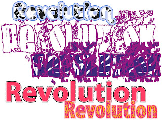
  In our first session with Andy, with our names, we experimented with: the colours and patterns available that could be used to fill in the body of the text, as well as that which can be used to fill the line that outlines the text. At the same time, we were able to experiment with the width of the outer line (bearing in mind that a very thin line wouldn't be visible, and a rather large outer line would make the writing almost eligible), and finally, the size of the individual letters in relation to others surrounding it and the positioning of each against one another; this could only be achieved however by adding outlines to the original text, making them editable before anything else. (Similarly, if we created outlines to text, not only could we do this but we could also, by layering an assortment of straight lines over the original text, we could seperate the actual lettering itself.)

3D Text

3D Text
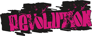
  In our second session with Andy, after having typed "Superman", chosen our font (preferably a bold block style text) as well as the colours / patterns we wished to fill both the main body and the lines with; by selecting "Effects" and "3D" we were able to alter the angle of the lettering and the extent to which the lettering drags backwards, in turn producing 3D text.

  At the end of the day, I could have used the word "Superman" to produce a sample of 3D text as was suggested in this particular session; nevertheless, to me it made more sense to experiment with the word Revolution as this the title of the music magazine that I was designing with Julie in her sessions around the same time. My thought process was that if I liked the result of one of these experiments significantly more than those alongside it, whether that be by using multiple strokes or 3D text. In turn, I could have incorporated this into the front cover design of my magazine. Unfortunately, I didn't choose to use any that I had produced with Andy. Although I liked the majority for different reasons, I thought that the use of such bright colours (for example: baby blue, violet / magenta, pink and yellow) although aesthetically pleasing to younger people, wasn't suitable for a teenagers / young adults magazine. It also wouldn't compliment the dark, ominous feel I was trying to put across through the design as well as topic of the magzine. Furthermore, I believe that the significant use of black used in the 3D Text experiment above, alternatively does put across this feeling but subsequently makes the text a little difficult. This particular factor in turn makes the final experiment unsuitable as well.


Basic and Building Graffiti

Spirals (Basic and Building Graffiti)
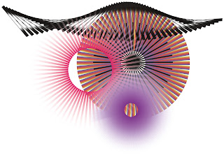
  In our third and fourth sessions with Andy we learned how to make patterns such as the "spiral", through the use of a new tool entitled "Rotation".

1) Draw a single line, or as an extention task, a small pattern.

2) Select the "Rotation" button, to the left of the screen once.

3) Hold down the "Alt" key on the keyboard and select and when a small icon appears at the tip of your mouse, select a place on the screen where you would like the spiral to rotate from (ideally at the end of the line / pattern you have just drawn to begin with).

4) A small box will then appear in the middle of the screen. Here you select the angle you wish to have between each line / pattern in the spiral (in other words, this will determine how many lines / patterns there will eventually have in the completed apiral), and then, when your happy select COPY.

5) The box will now disappear and all you have to do in order to complete the spiral is to press "Ctrl" and "d" at the same time repeatedly until the spiral is complete.

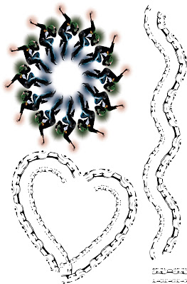
  Furthermore, we also learnt how to create alternative "Pattern Brushes" by editing an existing image from the Internet and often shrinking it down (preferably featuring something similar to a chain or an object surrounded by white negative space). You can then use this to paint on Illustrator.
Spirals 2 and Live Trace (Basic and Building Graffiti)

Recreation Google Logo design in Abode Illustrator CS6

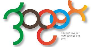
  In our final session of the project with Andy we had to use all the skills we had learnt with him on Illustrator over the last few sessions to recreate an existing Google logo. This entailled experimenting with use of shape, colour, gradient and drop shadows. All these skills are useful if and when we design are own logos in the future. Here is my attempt:

Though I was limited with the software we were using as to what I could and could not produce, this would explain why there are some details, particularly shadows that I are missing from my attempt. Despite these miner set backs, I'm still happy.

Some Rich Young People In Leeds Never Carry a Crystal Guitar Or Come Along To The LIbrary This Summer.


 In this session with Tony, we were given the oppotunity to venture, in small already arranged groups, into the centre of Leeds to take pictures of words (either on shop windows, the side of buses or pretty much anywhere), before heading back to the classroom and constructing a sentence with those that we captured.

Monday 15 October 2012

Exquisite Corpses (week one)

  In my first session with Tony, in fact my very first session at college, we explored the definition, the introduction and famous examples of Exquisite Corpses. An Exquisite Corpse is a variety of images arranged to create a human shaped form.

  First of all, every member of our tutor group was supplied with a plain A4 sheet of paper. We were then instructed to fold it into thirds and on the top third draw an object that looked like a face. We then past the piece to another member of the group after having folded it so the next person couldn't see what the previous had drawn, and draw an object that could look like a body and so on. Here are the ones that I contributed to (my parts are quite faint but I tried to get a close up):


  In the second half of the session we used magazines to create our own Exquisite Corpses!!

Dry Point Etch (week four)

  In our fourth and final session with Dave and Mick during the induction weeks we were introudced to a new technique entitled, "Dry Point Etching" (this was the same technique used to print the Bible after it was identified that scribes, although accurate, were too slow). Firstly, we had to find an approapriate image to use whether that be one we drew oursleves, from a magazine / newspaper or from the Internet. In the end, I chose an eerie image, from a fashion magazine, of a male model and a dark silhouette behind him. I decided to choose this image because it was interesting, we were using a similar coloured ink to print the image once etched into a piece of clear plastic that we were then provided with, and it gave me the oppotunity to use different shading patterns, including dots and cross-hatching!


Graphite Image (week two)

  Our second session with Dave and Mick consisted of two sub exercises. First of all, we drew 3D shapes, although predominantly spheres; decided upon the location of a light source and then used  8B drawing pencils to add approapriate shading onto the image. Then, as an additional task, we could use coloured pencil crayons as an alternative:


  In the second half of the lesson, after a short preview of drawings of the same style, produced by Mick and Dave themselves, we were shown how to draw perspective pictures, using vanishing points. As I had already been introduced to this particular effect you can create in pictures, a number of years ago, I felt incredibly confident and used this time to attempt to draw a car in perspective (although it didn't really look like a car at the end, lol).

  Unfortunately, as each individual session only lasts two hours each I was unable to produce the amount of work I had initially aspired to achieve so I created a further perspective picture at a later date, based upon the set of Eastenders!


Sunday 14 October 2012

Distructure (week four)

  Our final session of week four with Tony was entirely focused upon the evolution of stop animation (the technique used to produce Wallace and Gromit). After having watched a couple of five minute clips made through stop animation, including one by our teacher, as well as another featuring two men at a restaurant who can't gain the waiters attention, theretore begin to eat inanimate objects (including items of clothing) and later, one another.

  Here is my first attempt at a short stop animation video (using "Photobooth" and "Abode Premier CS6"):

Shrine (week three)

  My favourite session of the first four weeks, by far was our third session with Julie. After having been informed in our first session two weeks prior that we were constructing a shrine to something we were passionate about or someone we were inspired by, although asked to provide are own materials to create the shrine this session many didn't come prepared some were completing session four, as I and others made our Shrines.

  In the end, I decided to dedicate my Shrine to a musician and a dancer / actor: Michael Jackson and Patrick Swayze. Although these are, undoubtedly, two very different people, both inspire me hugely in different ways and therefore I felt it was only right to incorporate both, one half of the Shrine dedicated to one, and the other to the other. (We had a choice to produce the Shrine in 2D or 3D, as long as we brought the required materials ourselves and I decided to make it 3D as I thought I would have more oppotunities and it would be more impressive, at the end of the day :).)

Sketch Book (week three)

  Sketchbooks come in a variety of shapes or sizes, a differing number of pages and different covers, nevertheless all are made out of high quality paper which, in turn allow a large variety of techniques to be used withough any ink seeping or holes in the paper that can ruin the work inside.

  During this third session with Dave and Mick, each student in our group, of which there are seventeen were provided with fifthteen A4 sheets of this high quality paper and two A4 sheets of thin cardboard (either cream or black). We then learnt, in stages that were demonstrated as the session continued, how to create a small A5 sketchbook binded with a Coptic Stitch using the listed paper provided, as well as various over tools given to us throughout the session. Stages included:

1) Fold all sheets in half before separating the high quality folded sheets into five groups (or "signatures") of three.

2) By using an "awl", make five small holes in the creases of all the sheets and make sure they all line up with each other (these didn't have to be very big as they only need to be able to fit a needle and thread).

3) Using a blunt needle and thread of your choice, complete the sewing pattern that was demonstrated by the teacher and repeat until all signatures and cardboard front and backs are binded before tying off the end (although some in the group struggled with the sewing sequence, I didn't find it too difficult).

  Tip: You have to make sure that while completing the binding, the thread is always tight, because if not the pages will be loosely binded and although might not fall off, the end product won't be as good!

  This is the sketchbook I managed to make within this two hour session including a closeup on the binding itself. I'm really happy how it came out as all the pages are tightly bound together and its very neat:


Colour Work (week one)

  In our first session with Mick and Dave we were first divided up into four small groups, given a piece of A3 and told to come up with several different reasons as to why colour is used in advertising. These small spiderdiagrams produced within this small exercise were then lined up and presented to the rest of the group and each group were asked, individually about the points they had made; such points were as follows: "to appeal to a specific target audience eg. children, boys, girls, adults or different nationalities." Or alternatively, "to ensure that a particular object / company is memorable through the use of the same colour(s) for all public advertisement and branding (eg. Asda)".

  As a group, we were then provided with some items of iconic food packaging, as well as a limited array a paints; the three primary colours (of which all colours can be produced) and white. We were instructed to choose an item of packaging and pick a colour present to try and re create using the limited colours provided, I chose a "Mars Bar" box and attempted to re produce a cream colour (which I struggled with slightly because I was unsure as to how to make brown) and orange / red colour, before later choosing an apple juice carton and re creating a light blue tone.


 Finally, as a plenary exercise we were asked to pick a primary colour (either blue, red or yellow) then continue to add little bits of white to make as many shades from that chosen to white as I could. At the very end of this session we were asked to right a short evaluation of the session and our progress: what we learnt, what we enjoyed in the session and what we could improve on, as established during the session.

Friday 12 October 2012

Love Your Body- Poster Design (week 4)

  In our fourth session with Julie, we were instructed to create a poster displaying the message "Love Your Body" in one way or another. Our brief was fairly straightfroward, however, we weren't provided with any images, words and "suitable" fonts as in the first couple of weeks therefore we had to use our imaginations considerably more and I believe that I enjoyed this session a lot more than those beforehand (execpt for the session focused on building a Shrine) for this reason.
 
  This is the image that I eventually produced within the two hour session:

  This is rather briefexplanation as to how I produced it:

1) Typed "silhouette of a woman" into Google Images and found the background image of the young girl and the tree.

2) Opened it up on Abode Photoshop CS6.

3) I opened a new layer and painted the whole image over in a light pink colour before selecting the rubber with a soft brush to rub out the areas where the girl, tree and ground were. I then lowered the transparency on solely this layer which meant that, although the pink is still visisble as are the details in the sky, for example: the clouds.

4) Next, in order to incorporate the message in my image I selected the text tool (which automatically creates an additional layer) and typed "Love Your Body. Be Free." (the second sentence was initially inspired by the fact that the girl is holding her arms out wide towards the sky). Nevertheless, I felt that there was a lot of negative space in the image therefore, by using "copy" and "paste", I was able to occupy all this space. Furthermore, it then appeared too crowded so I selected a colour, used in the sky and changed all the text to this same colour so the text once visible over the sky had mostly now become invisible.

5) Finally, I wanted to highlight the message, "Love Your Body" so I simply selected it once in the text and changed its colour to white. Its subtyle, yet PERFECT!

  At the end of the session, after Julie had seen the image we had created, I was told to use Abode InDesign CS6 to produce a range of posters, with different layouts, that included this image. I made two in the last twenty minutes and they will uploaded shortly. :)


5x4 (Photography)(week 3)

  In our third session with Howard, we produced, first a negative exposure in the victorian style of Julia Margaret Cameron after having being introduced to a Sinar camera and a short demonstration of how we were to set it up (an exposure time of eight seconds and an aperture of 5.6 was essential because the photographic paper we were using was not very light sensitive). At this point we broke into pairs and all attempted to take as well as model for a negative.

  After this, we remained in our pairs and entered the darkroom where we:

1) Developped each negative exposure as described in Photograms (week one)(photography).

2) Created a positive exposure by layering the negative exposure face down over another piece of photographic paper, shiny side up, and set the camera aperture similarly to that of the Sinar camera but made the exposure time slightly longer at nine seconds (we produced in a similar way in week one).

3) Developped this new exposure, again in the same way as previously.

This is the negative exposure of myself:


This is the positive exposure that I produced by using the exposure, taken by using the Sinar camera:


This is the negative exposure that I took of a friend of mine called Ryan, as well as the Sinar camera that I and the rest of the group used throughout the session:

Tuesday 9 October 2012

Picture Manipulation (week 3)

  In our third and final session with Zoe, we were presented with an assortment of iconic images, including those of: female models and cars. Following multiple five minute demonstrations throughout the two hours before we attempted the same on our own (with these images as well as alternatives from the internet) we were taught how to:

Change the hue / saturation / colour balance of sections of an image as opposed to the whole image:

  By using the lasso tool, or alternatively, the pen tool to outline the place you wish to change (in this particular example, the main body of the car, minus the windows, roof and wheels). After having outlined this desired area, you go to the top of the screen select "Layer", "New Adjustment Layer" and "Hue / Saturation" (selected in this example) or "Colour Balance" respectively. Finally, you experiment with the colour, brightness and saturation while preveiwing these changes you've made until you are satisfied!

From this:                                                                 To this:

  Similarly, you can create the same effect by adding an adjustment layer then using black and white to select the areas in which you wish to saturate (black means this won't be changed whereas white means the opposite), for example:

From this:                                                                                                 To this:


  Tip: you can use the exact same method as that previously explained in order to change the saturation / hue / colour balance of parts of a persons face, so if you decided to do so it is a good idea to select "colourize" before changing the colour because, cosequentially, those you can choose, although more limited, are more natural colours!

Retouch an image of an individuals face through using "Liquify" (unfortunately only available on Abode Photoshop CS6 as far as I am aware) or the "Spot Healing Brush Tool". Here is an example I did following the lesson on Photoshop CS4 Extended:

Before

After

Age an Image:

  Thirdly, through demonstration in the session, I now understand that there are various ways to age an image visually by using photoshop (however you must always remember to introduce a new layer when making any modifications as you may make a mistake): 1) you can paint over the image in black then add, with a very soft brush, a dash of white in the centre, or 2) paint over the image in a mustard colour then lessen the transparency to give the image a worn sort of look. But when it comes to it, if you understand how to do both, why choose when you can add both to an image!

  Finally, for the last twenty minutes of this two hour session we were given the task to recreate a Rihanna album cover which was chosen especially by Zoe, this sessions teacher, as we would need to use ALL the techniques we had learnt in order to achieve anything close to this finale image (bearing in mind there are obviously features we were unable to recreate, even with this software available to us for example, the fact her eyes are closed in the original cd cover image):

Original cd cover

My first attempt as I wish to try again, despite the fact that I am fairly contempt with it already!...
  Here is my second attempt that I completed in my own time:

  Honestly, I think that I this attempt was more successful; although, I used an older version of the same software in order to produce it, "Abode Photoshop CS4" as opposed to that I used to produce my first attempt, "Abode Photoshop CS6". Typically, most people would say the effects you can produce in the older version aren't as good, personally, I feel that this is NOT the case.

  In order to produce this image first I lightened the saturation/ hue of the entire image in an attempt to match her skin tone on the original CD cover. Then, I individually selected her hair and her lips and, similarly, adjusted the colour balance and hue / saturation (including making them lighter and darker in general) in these areas , again as an attempt to match those colours present in the original cover to the best of my ability (but ALWAYS remember to select "colourize" to adjust such areas). Last of all, I added the "finishing touches" by using a soft paintbrush to highlight the shadows present on the bottom right side of her face!


Friday 5 October 2012

ART IS RUBBISH!!!! (week 3)

A Review of Flannels Art Exhibition: What is it? Why was it introduced? Does it achieve its purpose?
  WPA Pinfold is an internationally recognised design consultancy who create original works of art by using recycled or unappreciated objects; they then sell them online or in auctions and donate all raised to a chosen charity each year. This year their chosen charity is entitled: “Aid to Hospitals Worldwide”, an organisation who provide developing countries with redundant hospital equipment that could save lives! Personally, I am confident that they are achieving their goal gradually because according to figures on their website visitors, sponsors and sales have considerably increased each year since it was first established in 2005 and ALL the artwork is brilliant and inspiring!!


A Review of My Favourite Piece at Flannels Art Exhibition
  After having visited the art exhibition with my group yesterday afternoon, I liked almost all the pieces of artwork on display for their originality and the methods used to produce them; nevertheless, my favourite is entitled “Passenger Portrait” (of the artist himself) by Chris McMahon. Consequentially, he decided to create it as he had a vast collection of train tickets from his expeditions to and from Manchester which he wished to recycle.

Passenger Portrait (of himself) by Chris McMahon

  Overall, I favour this piece for two reasons: firstly, although my friends have attempted to use tickets similarly by using them for wallpaper, here he uses considerably less, but the phrase: “less is more” appears more appropriate in this case! Furthermore, I like the contrast created through the use of black, orange and cream as it adds depth to the image, and finally, the black outline of the image above seems to join all the writing below.


Can Art really be Rubbish??!!

  Personally, I feel that although art can be created through any resources or mediams for example: paint, pastels and even on the computer, as I do at college, if I'm honest I feel that Art made through recycled and discarded materials such as that displayed in the exhibition is not only more diverse, its often better because artists can develop their own original style and display it. Anyone can draw or paint but only certain exceptionally gifted individuals can produce artwork such as this, made out of Rubbish!!!